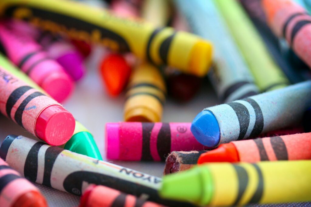
Color is more than just aesthetics—it’s a powerful psychological tool that influences emotions, behaviors, and decisions. In web design, the right color choices can enhance user experience, improve brand recognition, and ultimately drive conversions. Understanding color psychology allows designers to create websites that resonate with their target audience.
The Psychology of Colors
Different colors evoke different emotions and associations. Here’s a breakdown of how colors impact users:
- Red: Passion, urgency, excitement, and energy. Often used in sales promotions and call-to-action buttons.
- Blue: Trust, professionalism, and calmness. Commonly used in corporate and financial websites.
- Green: Growth, nature, and health. Ideal for eco-friendly brands and wellness sites.
- Yellow: Optimism, warmth, and attention. Often used to grab attention and evoke positivity.
- Black: Luxury, sophistication, and power. Frequently used in high-end and fashion websites.
- White: Simplicity, cleanliness, and clarity. Great for minimalist and modern designs.
How to Use Colors Effectively in Web Design
- Know Your Brand Identity Choose colors that align with your brand’s personality and values. For example, a financial institution may benefit from blue tones to establish trust, while a creative agency might opt for vibrant colors to express innovation.
- Consider Cultural Differences Colors can have different meanings in various cultures. For instance, while white symbolizes purity in Western cultures, it represents mourning in some Asian countries.
- Use Contrast for Readability High contrast between text and background improves readability and accessibility. Avoid using light text on a light background or dark text on a dark background.
- Leverage the Power of Call-to-Action (CTA) Colors CTA buttons should stand out. Red, orange, and green are commonly used to encourage clicks and conversions.
- Maintain Visual Hierarchy Use color strategically to guide users’ attention. Highlight important elements such as headlines, buttons, and key information with contrasting colors.
- Create Emotional Connections Colors set the mood of a website. A wellness brand might use calming blues and greens, while a fast-food website might use reds and yellows to stimulate appetite and urgency.
Examples of Successful Color Usage
- Facebook & LinkedIn: Use blue to convey trust and professionalism.
- McDonald’s & KFC: Use red and yellow to evoke appetite and energy.
- Apple: Uses white and black for a sleek, modern, and minimalist appeal.
Conclusion
Color psychology plays a vital role in web design. By understanding how colors influence emotions and behaviors, businesses can create visually appealing, engaging, and high-converting websites. Whether you’re building a new site or revamping an existing one, make sure your color choices align with your brand and target audience for maximum impact.
Need help choosing the perfect color scheme for your website? Contact Syntralis today and let’s craft a visually compelling design that connects with your audience!